
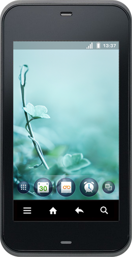

In an increasingly populated Android smartphone market it's becoming harder for manufacturers and operators to stand out from the crowd.
Android offers a great base functionality to quickly bring you up to speed with the competitors. But when everyone uses the same software, consumers are left only choosing between increasingly similar hardware.
This is where there has been a paradigm shift. The brand experience is no longer tied to the hardware. When the phone is mostly just a screen, that's where your brand needs to be.
This is what KDDI has taken to heart. They came to Ocean in 2008 asking for help to find their unique software style. They wanted their brand experience reflected in the graphical user interface, and an interaction that was more playful, more fun and more adapted to the Japanese market.

On location in Japan, we started with a thorough research phase in close collaboration with KDDI, consisting of user studies and a trend report. We were amazed at the how much users expressed themselves by customizing the outside of their phones.
This lead into a heavy ideation phase were our findings was put to the test. It consisted of numerous collaborative brainstorms, conceptual sketches and moodboards. We aimed to make even mundane tasks fun. If the users finds delight in doing repetitive tasks, they won't be bothered by them. We also wanted to educate the users by showing relevant elements only when they are needed.
Our interaction concepts were refined and animated and the graphical mockups was put into high gear. As the process went on, they merged into a single conceptual video that helped guide everybody's focus towards the final product.

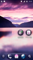
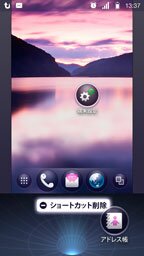
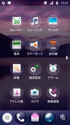
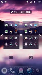

The homescreen has been the face of KDDI in two of their handsets so far: IS01 and IS03. They are both domestic products manufactured by Sharp, the IS01 being a "micro netbook" mainly meant for blogging or surfing the net. The IS03 boasts a more mainstream appeal with its candybar format and many Japan-specific features that up until now have only been available in legacy feature phones. Two examples are the ability to watch mobile TV and pay with the phone on the metro using an e-wallet function. It marks KDDI's real entry into the smart phone market, taking on the iPhone as well as its Android-based competitors.
Apart from the home screen redesign, Ocean has been helping KDDI continuously with application and service design, adapting some of their popular Japan-only services for their new devices. The music-player-and-more LISMO and the NaviWalk navigation and map search service will be out soon.
Find out more on the Official IS03 page! (in Japanese)
Watch our original concept video for the IS01!
| Hälsingegatan 43, 11331 Stockholm, Sweden | +46 8 508 907 90 |


