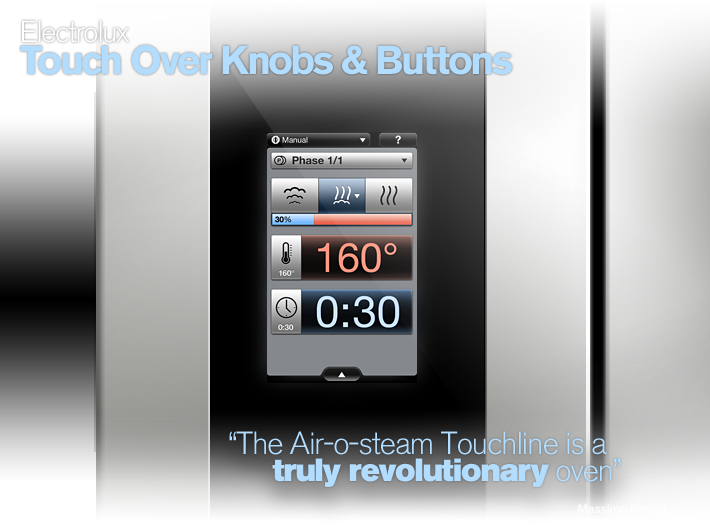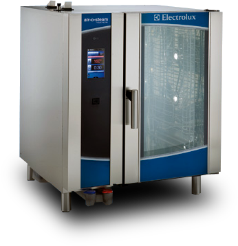

Electrolux Professional had decided that they needed to redesign the control panels of their hugely popular Air-o-steam combi ovens, used in professional kitchens worldwide. Traditionally their ovens used knobs and buttons – now they wanted to go for a touch-screen. They came to us for help with the interaction design and graphic design. The task was to create a user interface that was intuitive, friendly and pleasant while still being perceived as professional and reflecting Electrolux’s market leading technology.
One of the major issues was that the same appliance type is used by very different users, with very different needs. From Bocuse d'Or winners and fine dining chefs to company canteen staff and chefs in quick-service restaurants. However, the ovens on the market today typically give the users exactly the same feature set and user experience, which turns out to satisfy no chef completely.
One of the major issues was that the same appliance type is used by very different users, with very different needs. From Bocuse d'Or winners and fine dining chefs to company canteen staff and chefs in quick-service restaurants. However, the ovens on the market today typically give the users exactly the same feature set and user experience, which turns out to satisfy no chef completely.


From the very beginning, we took on a very user-centric approach using methods from service design and interaction design. During countless interviews with chefs from different markets and types of kitchens, combined with on-site user studies in actual kitchens, we established a good understanding of the problems with combi ovens today.
We set out to create a tailored experience, and in continuous collaboration with different chefs we developed a completely new user interface from the ground up. The work spanned several months and the last stages included testing of an interactive touchscreen prototype to really make sure that we were on track.
We set out to create a tailored experience, and in continuous collaboration with different chefs we developed a completely new user interface from the ground up. The work spanned several months and the last stages included testing of an interactive touchscreen prototype to really make sure that we were on track.


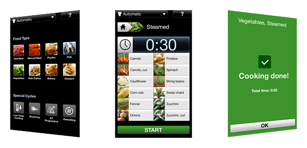
The Electrolux Air-o-steam Touchline - a technologically superb combi oven with an unprecedented user experience and level of customization. The large touchscreen allowed us to really adapt the user interface to the context, displaying only the information and features that are important to a given chef at a given time. And the chefs can change the feature set and behaviour of the oven to suit their own needs in a way no combi oven has allowed them to do before.
The graphics received just as much love and we gave a lot of attention to detail, down to the last pixel of the high resolution display. A coherent graphical language throughout the UI makes you feel right at home as you dig deeper in the interface. Important values such as time and cooking temperature use high-contrast colours that can be seen from across the kitchen. Buttons are large and easy to touch even with gloves on.
But we did not only think about the chefs - the cleaning feature is much more accessible for staff cleaning the restaurant after hours, and the Electrolux service personnel are happy about great alarm logs and easier setup.

Find out more on the
Electrolux Newsroom page!
Electrolux Newsroom page!
| Stockholm (HQ) |
Tokyo |
||
| Hälsingegatan 43, 11331 Stockholm, Sweden +46 8 508 907 90 |
Azabu Green Terrace 5F, 3-20-1 Minami-Azabu, Minato-ku Tokyo, 106-0047, JAPAN +81 80 3171 7282 |
||

